athenahealth / State of the Smart Campaign
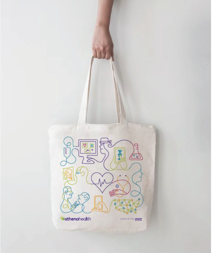
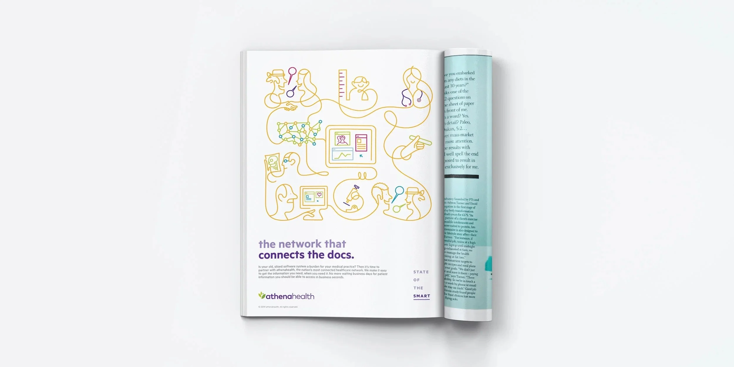
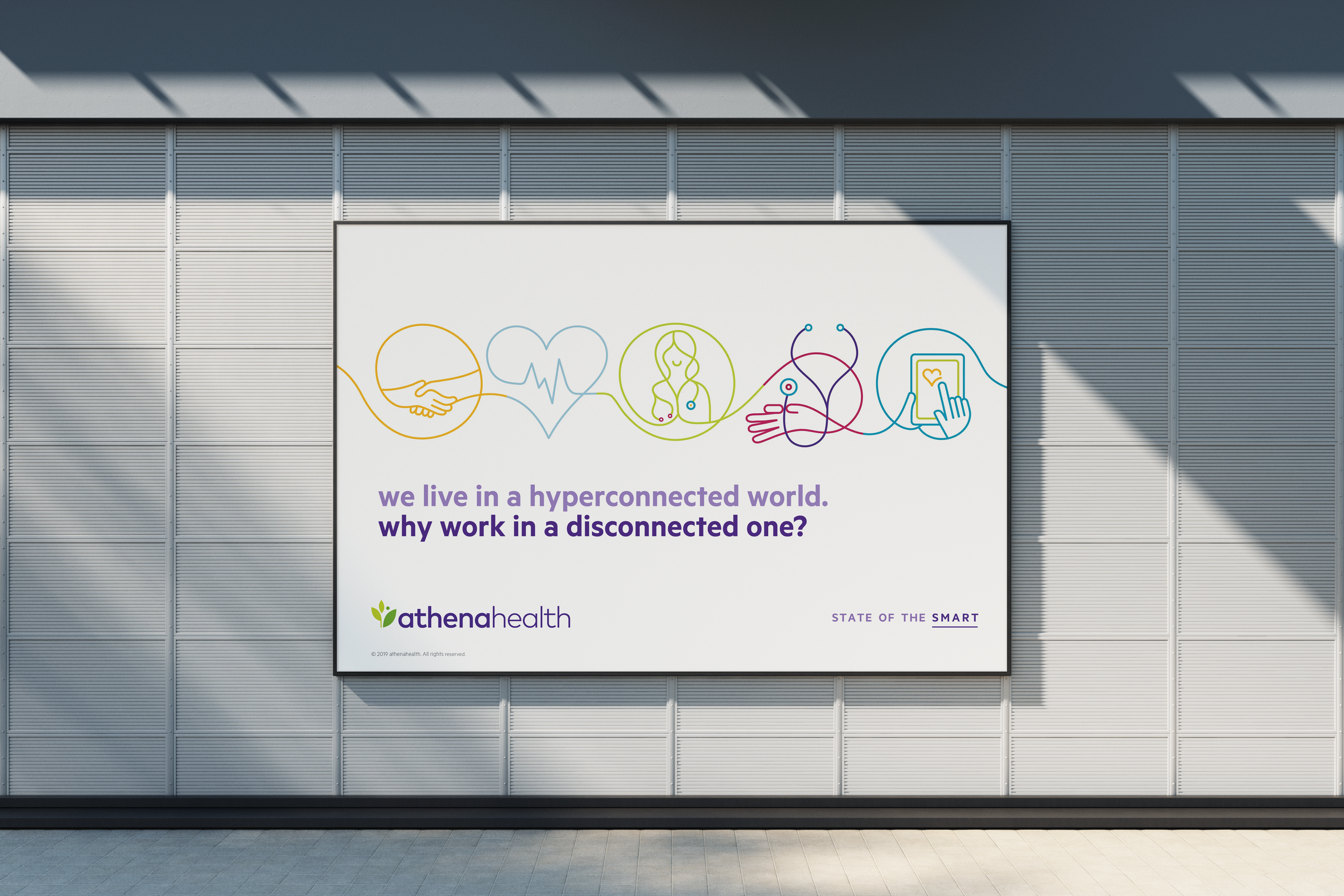
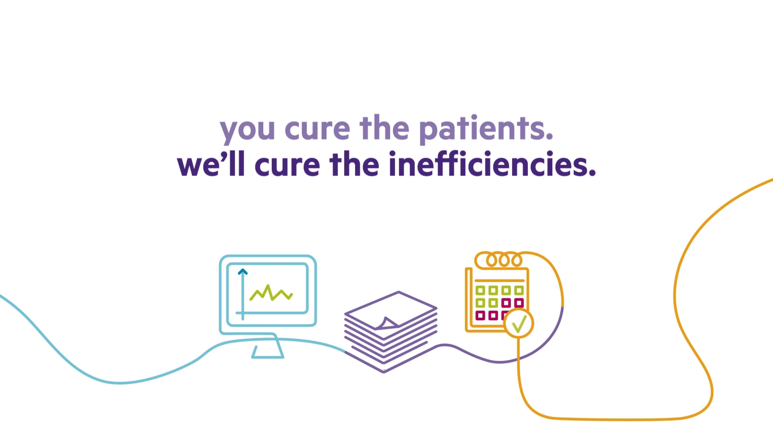
Medical advertising is a visual sea of sameness, drowning in stock photos of smiling doctors and the overuse of green, blue, and salmon. To break out, we created an integrated campaign that not only visually pushed against the category, but also brought athenahealth’s interconnected healthcare network to life. Illustration by Jonathan Calugi


:15 Animated VIDEOs


:06 Animated VIDEOs


Design Elements


TRADE SHOW DISPLAYS